Faster campaign setup for an AI marketing platform
- Overview
- Airea is an AI marketing platform that writes on-brand copy for campaigns across search, social, email and SMS. In beta, early users found it slow and hard to navigate, and left tasks unfinished. As the only designer on a team of seven, I found where it was going wrong, prioritized fixes with the CEO and developers, and redesigned the flows that mattered most.
- Impact
- Three redesigns launched: a simpler navigation, a one-page knowledge base for brand setup and a 3-step campaign creation flow.
- Role
- UX Designer
- Duration
- Dec 2024 – Aug 2025
- Team
- CEOManaging DirectorDomain expert3 Developers
The problem
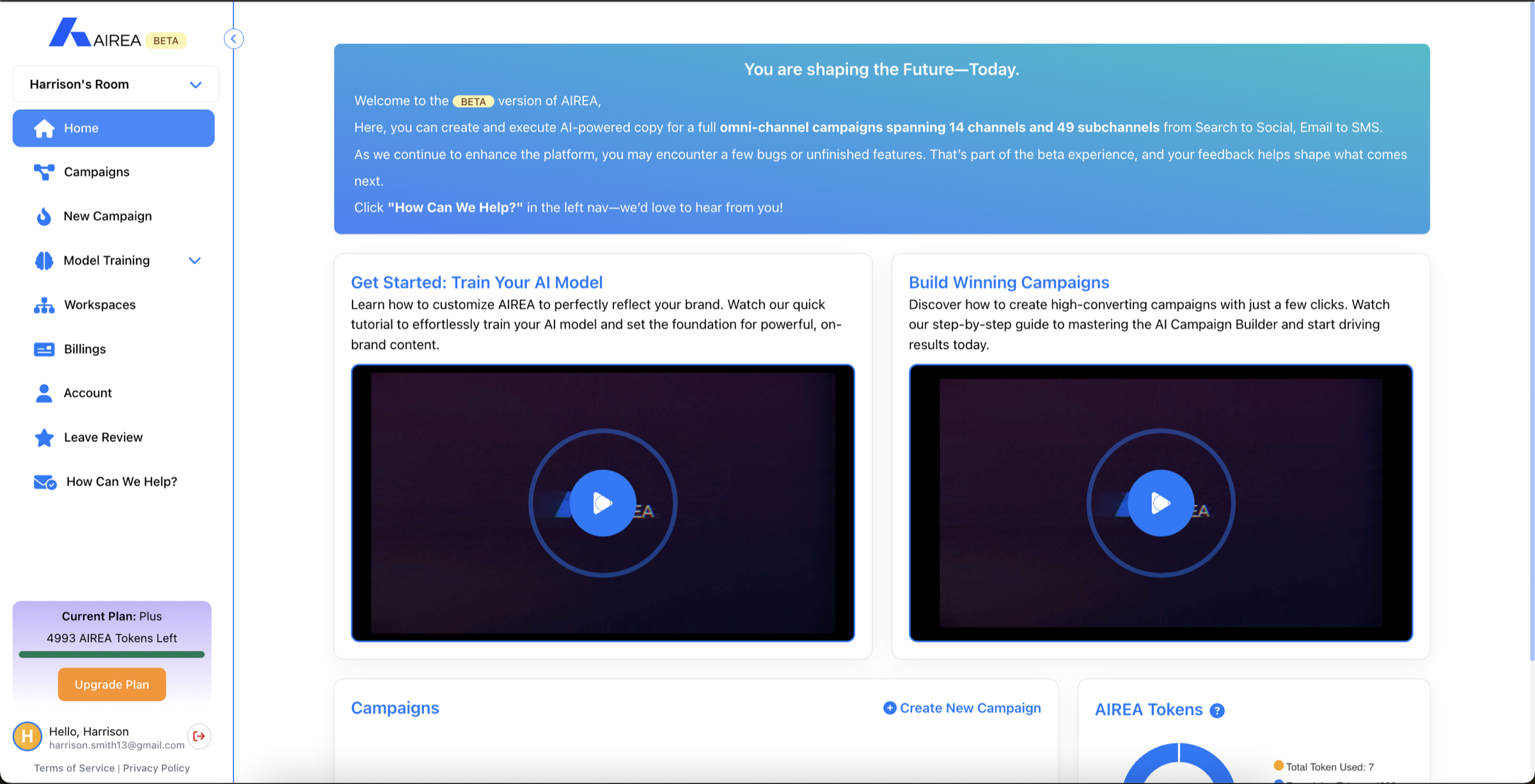
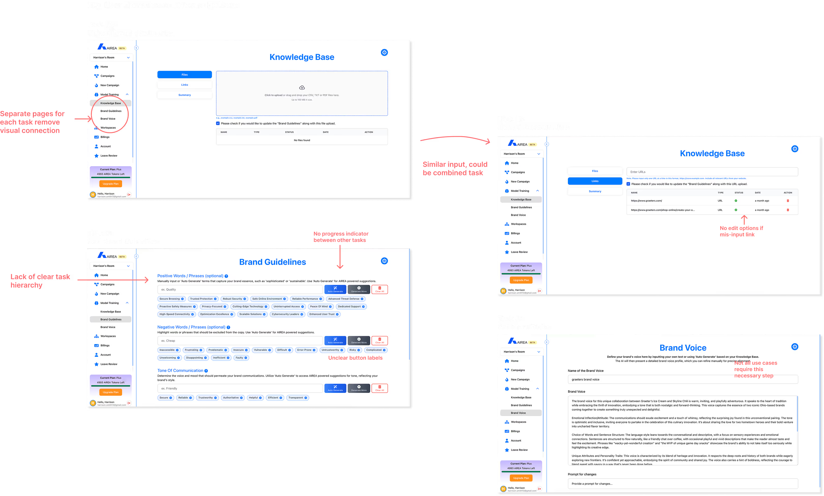
Airea’s users are performance marketers on small teams who run several campaigns a month and need to move fast. The beta was slowing them down: a flat navigation with nine equal items, brand details entered more than once, and core tasks split across disconnected screens.
The constraints were tight. The developers were overseas, real users were hard to reach for research, and timelines favoured fast iteration over polished prototypes.
Choosing what to fix
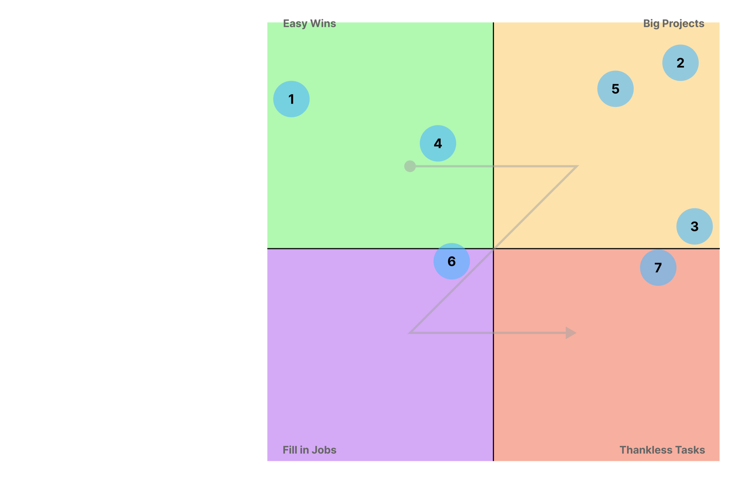
With no users to test with, I gathered what the team already knew and ran a heuristic evaluation of the main flows. Together we came up with seven possible fixes and plotted them by effort and impact, so a small team could put its time where it counted.
What launched
Navigation
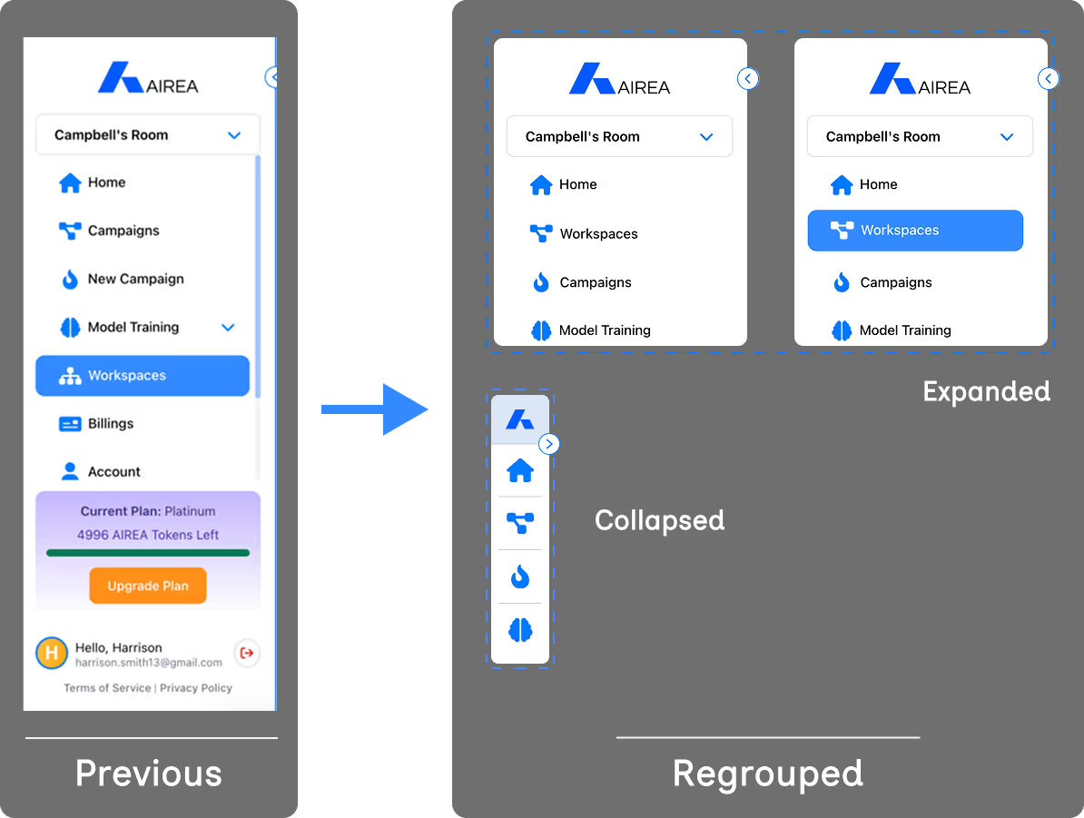
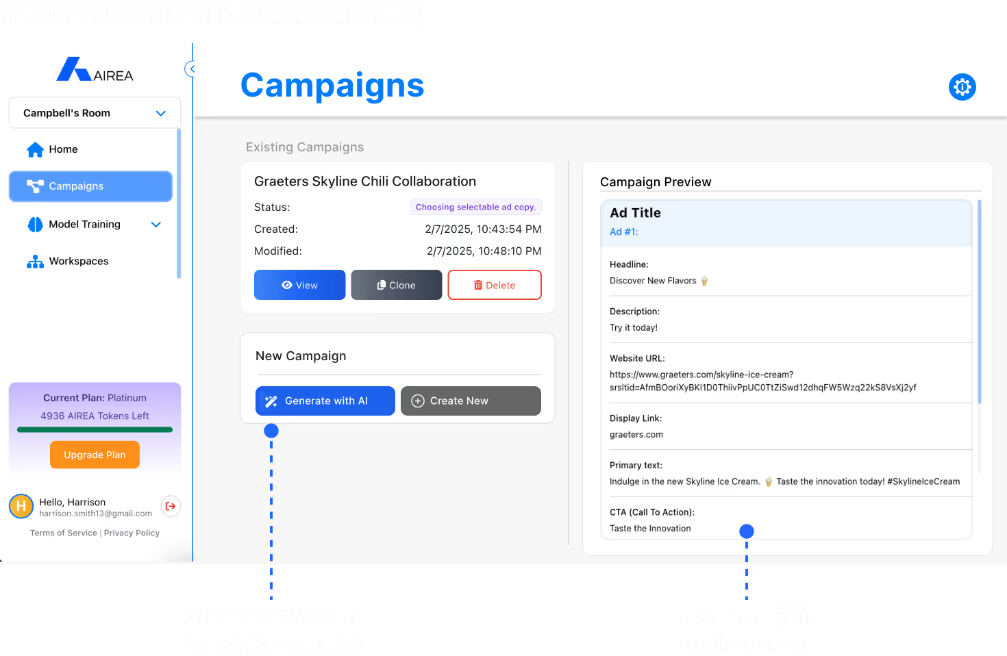
An easy win. Nine sidebar items became four, and the sidebar can collapse to icons. Campaigns and New campaign became one page, and account and billing moved under the profile.
Brand setup
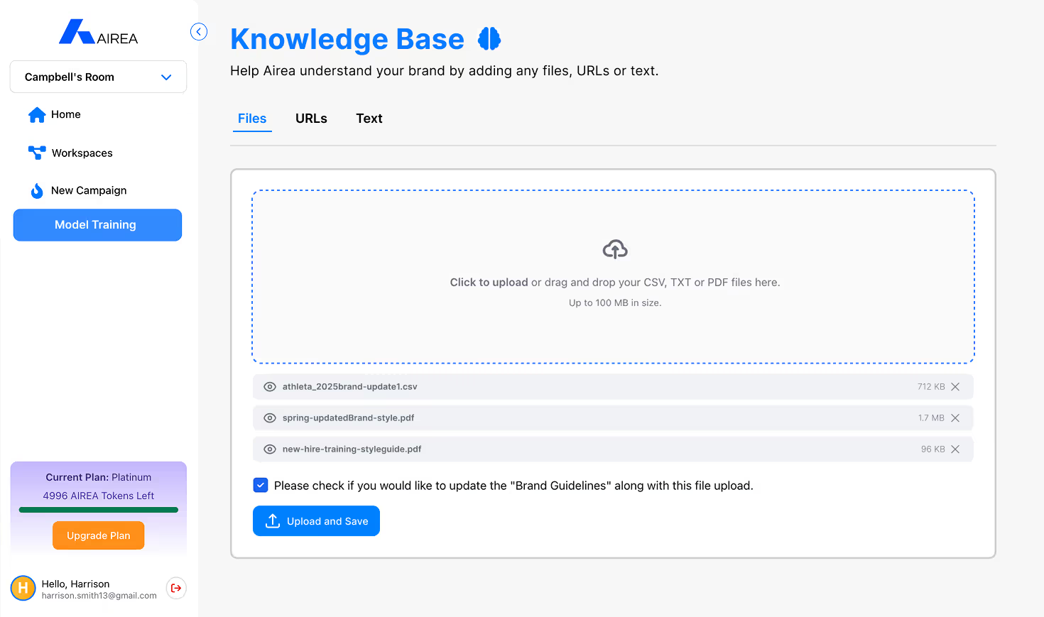
Before writing copy, Airea learns a brand from its files, links and guidelines. That setup was spread across separate pages with no sense of progress. I combined files, URLs and text into one Knowledge Base page.
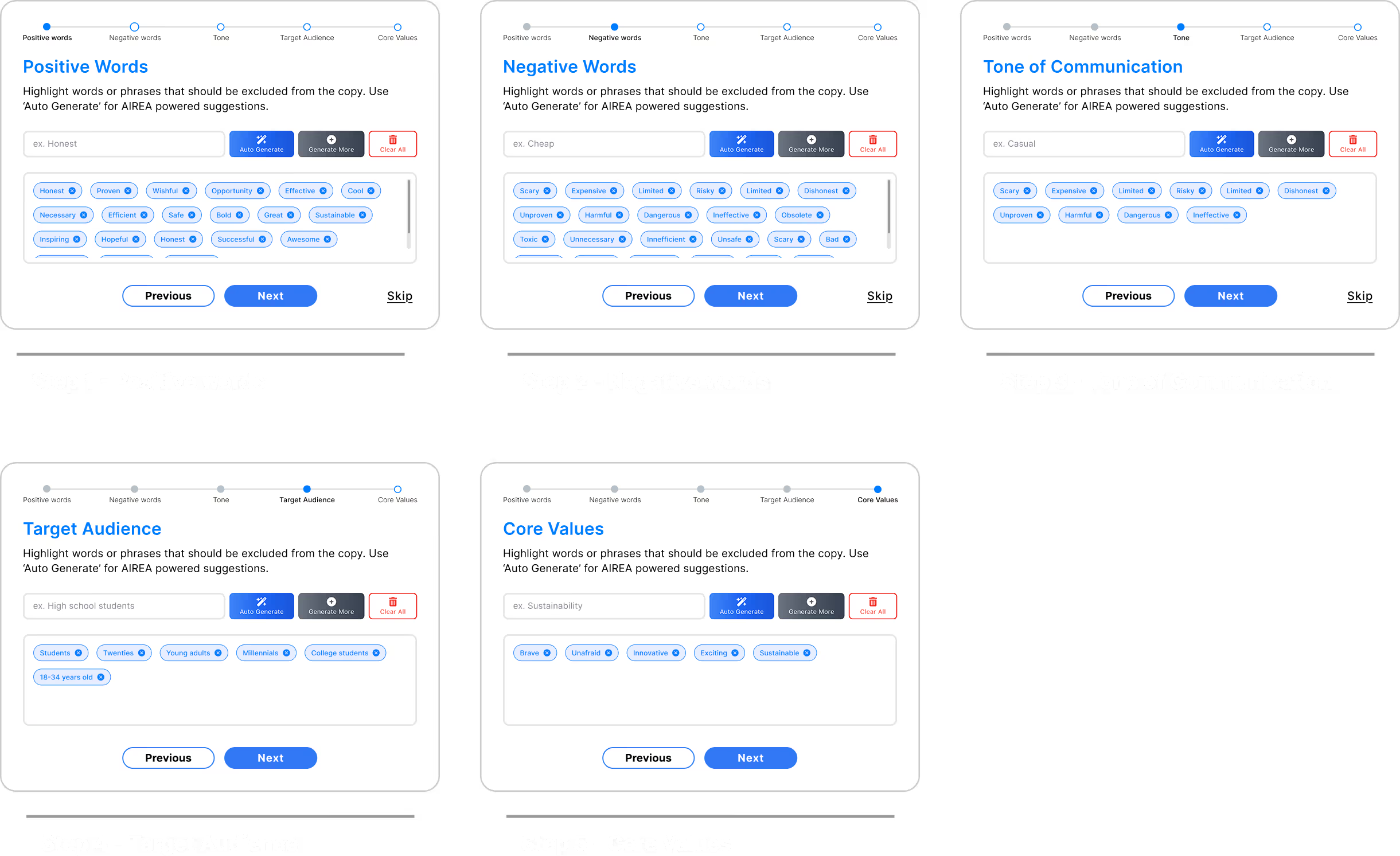
I also designed a step-by-step version of the brand guidelines. It made each step lighter, but it added steps overall, and experienced users wanted speed, so we didn’t build it.
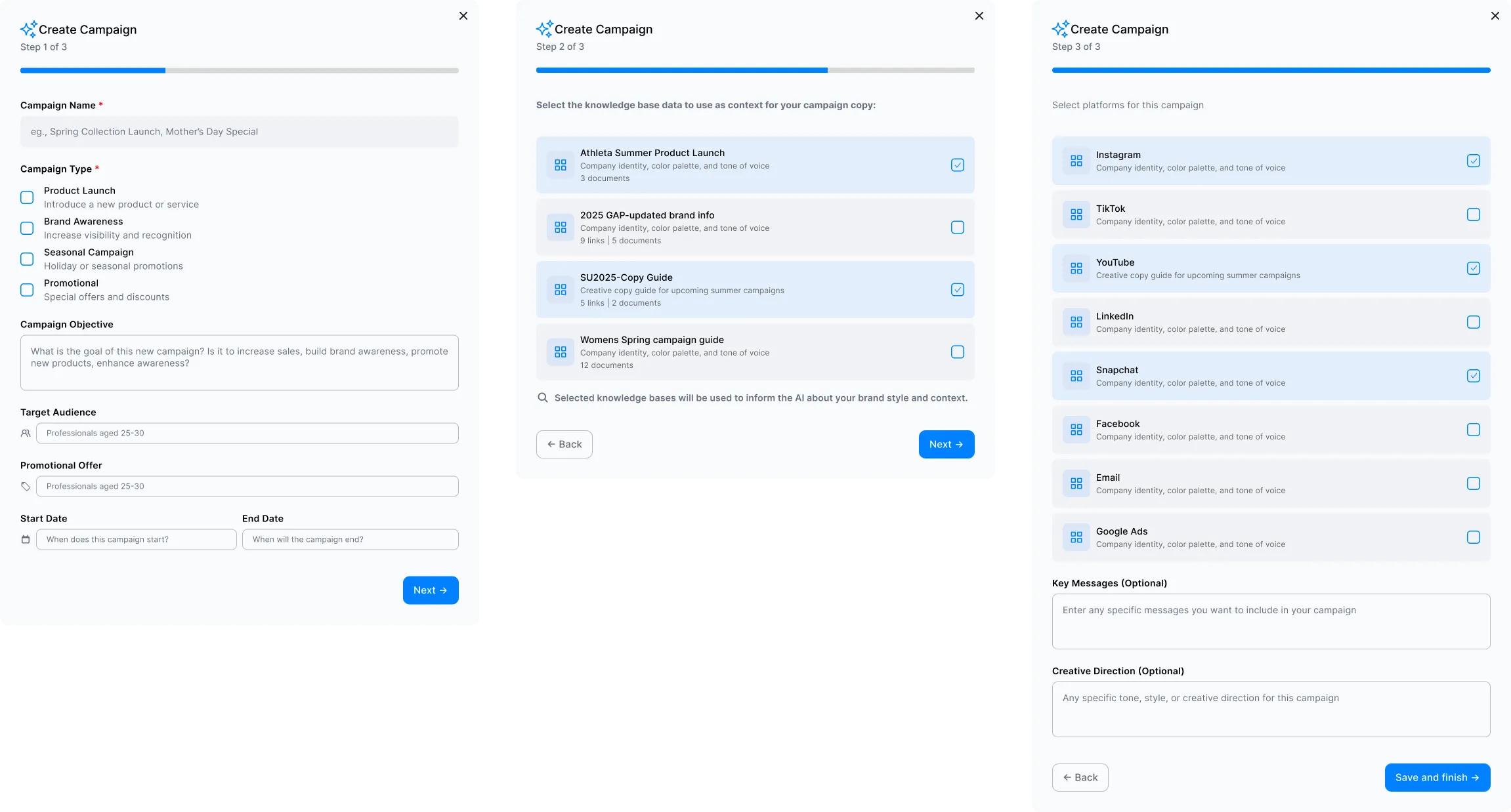
Campaign creation
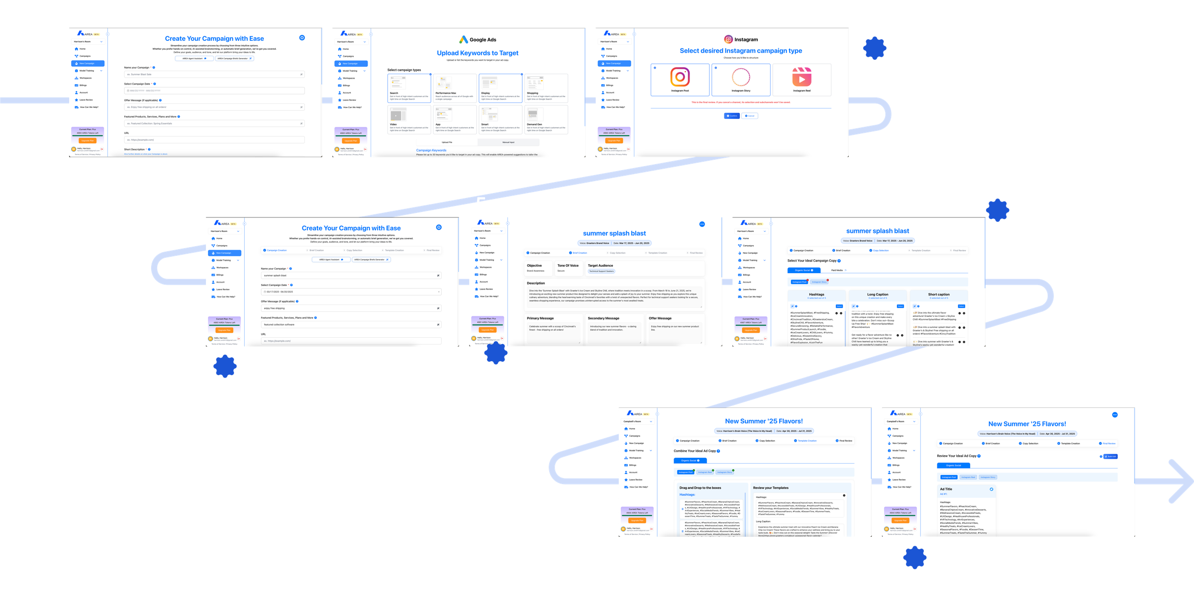
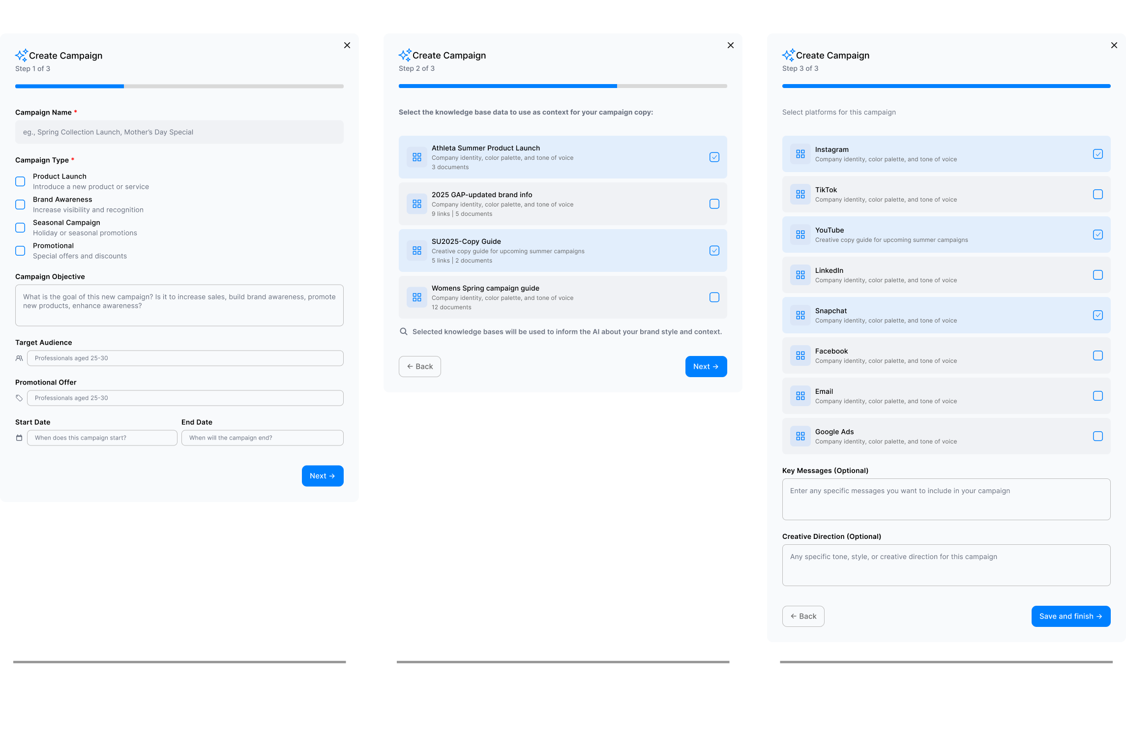
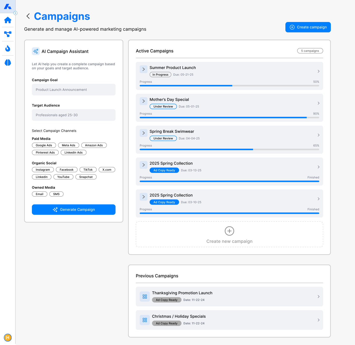
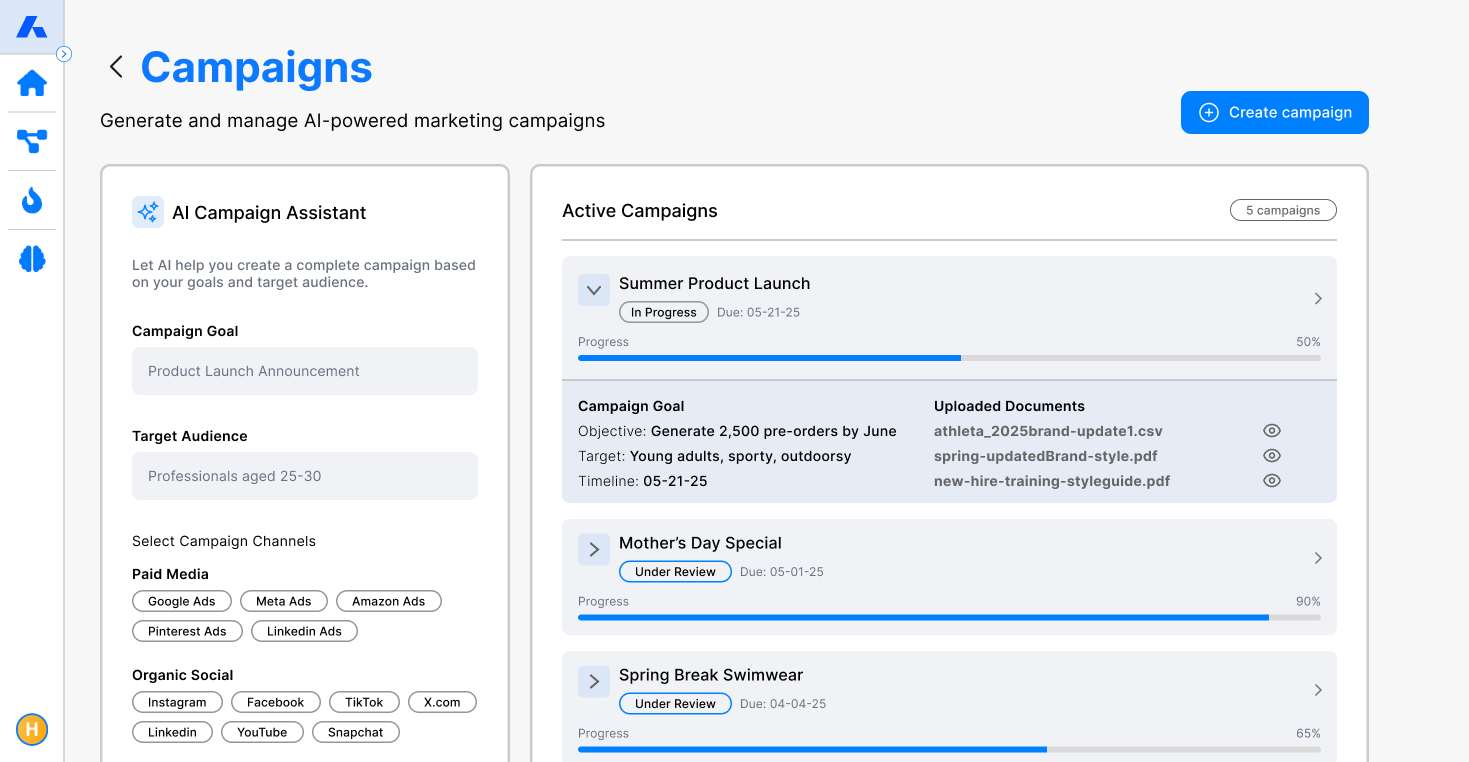
The most important flow, and the biggest change. Creating a campaign took about eight disconnected screens. Now it’s three steps: the basics, which brand knowledge to use, and which channels to write for.
Where it could go
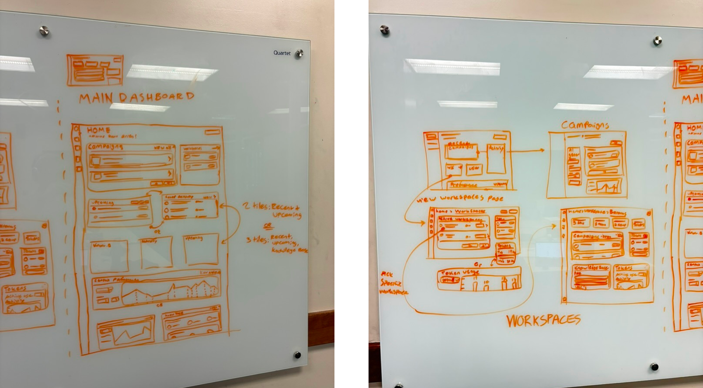
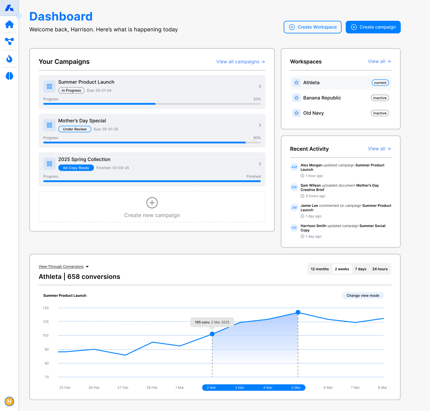
Features still felt disconnected, and there was nowhere to see every campaign, workspace and recent activity at once. I sketched a campaign-centred home and took it to high fidelity. The CEO and managing director backed it as part of the product’s future, though it wasn’t on the roadmap yet.
What I learned
- Impact comes from choosing the right problems. With a small team, deciding what not to build mattered as much as the designs.
- Focused flows beat clever ones. The guided setup was the more interesting idea; the simpler page was the better one.
- Balance users against real limits. Every design had to fit what the developers could build in the time we had.